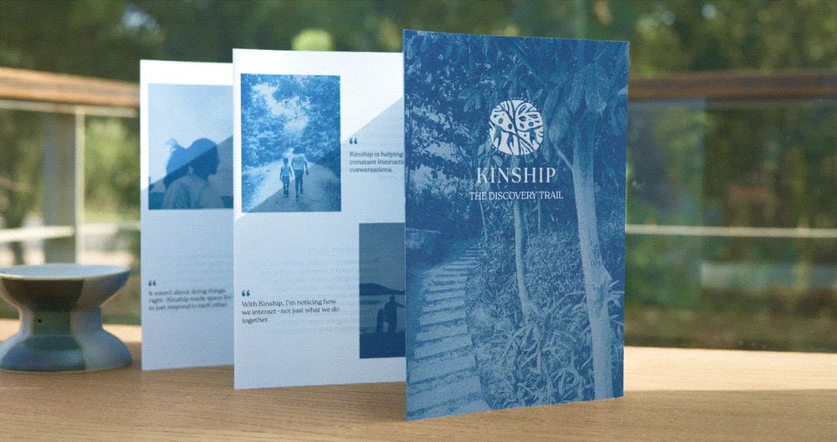
Kinship
Identity, brochure and website copy for a company that takes parents and children away from the routine for long enough to talk to each other properly.
Context
Isha Talsania and Ambica Agrawal run Kinship. They call themselves catalysers rather than founders, which tells you most of what the brand is. It runs day-long immersions in the city and on farms, and short retreats in natural settings, mostly for families with children between nine and thirteen.
That age range is the point of it. Nine to thirteen is when a child starts having a life their parent is not automatically part of, and the habit of talking to each other is still forming while the window is closing.
What Kinship offers is not an itinerary, and all the material it had was itinerary.
Approach
The identity is warm and restrained on purpose, so that the words can do the work. The site leads on Connections and Conversations, and the promise under it is time to slow down with nothing to perform.
The harder problem was colour. Kinship runs several kinds of experience, from a city discovery trail to a storytelling circle to a quiet piece of family reflection, and each one has a different mood. The obvious answer was a bigger palette, which would have made every experience look like a different company.
So there is one core palette, and each kind of experience gets a sub-palette drawn out of it and tied to mood rather than to category. Warm clay and rose for expression and celebration. Olive, moss and sea tones for the work outdoors. Mist and stone for reflection. They hold apart when you see one and together when you see them all.
- Logo and brand guidelines
- Colour and typography
- Brochure
- Website content and copy